Out of your head – “Journey for Berried Treasure”

BRIEF:

GROUP PROJECT: The Indecisives

  • Amy
  • Elena
  • Vlad
  • Favor
  • Olga
  • Virgil-Pai

We had to choose six words from word cloud and write a story. The final outcome was to deliver a 30 seconds video. Once we had chosen the keywords, we each worked on concept ideas.

The Key words used were: Tiny, huge, decay, hope, disruption, trust

PRE-PRODUCTION:

INITIAL CONCEPT:

Once we had chosen the keywords, we each worked on different concept ideas. Everyone tried different ideas, such as flying stories, treasure hunting, weird characters, and insect adventures. Eventually, we agreed on the insect story, which then evolved into the caterpillar and ant looking for a berry. We called the story Journey for Berried Treasure. This started as a pun, and we decided to stick with it. I struggled with this part of the process because I became stressed about finding a story idea, but I did agree with the final concept. This is something I need to work on, as I get stressed very easily when I am asked to think of a concept under pressure. I also need to realise that there are no bad ideas.

Concepts from group:

Initial concept: Two ants (or otherwise tiny creatures – later changed to a caterpillar and a ant) are travelling the forest floor to make it home, but must cross a log submerged in a puddle. They cautiously try to make it across, but the log is rotten and breaks apart when the second one is halfway through. The second one loses hope and thinks they will drown, but must trust their partner who helps them back up. Relieved, they continue to head home to their colony.

Initial script: Two bugs, an ant and a caterpillar, set out to find food before they starve. They travel through a rotten, lifeless forest and reach a gushing stream that looks impossible to cross. The ant studies a map while his hungry, clumsy caterpillar companion waits beside a small boat made from leaves.
The ant looks up and sees ants flying overhead. His wings flutter, but they are too small to lift him. Annoyed at first, he regains focus when the caterpillar calls to him. They board the boat, with the ant steering, until it suddenly lurches. The caterpillar has been eating the boat, and they begin to sink.
The ant is angry, but seeing his friend in distress, he grabs him and pulls. His wings push out and flap desperately, and after a struggle they reach the other side, right in front of the berries. They hug in relief, and the ant is proud of overcoming his struggle. If there is time, it cuts to an overhead shot showing how small the puddle really was.

STORYBOARDS:

My storyboard:

We all focused on creating a storyboard for 1 scene. I found the process difficult because I kept drawing blanks in my head. This was before we had a clear idea, so my scene kept changing. My original idea was to have the ant looking up and seeing ants flying, then looking down at his own wings trying to fly. Because the story and scenario kept changing after teacher feedback, this idea was eventually scrapped and redesigned to fit the final version.

Other storyboards from the group:

Elena

The storyboard process was stressful and changed many times. We made several storyboards, but none of them stuck at first. When the teachers checked it, we were told it the story was not clear enough. We had to keep changing the scenario based on feedback, which made it feel like we had to redo the storyboard many times. Eventually, it was green lit, and we were able to move forward.

INITIAL SKETCHES & CHARACTER DESIGN:

In the beginning, we all worked on sketches and concept ideas for the characters. Everyone tried different ideas and designs to see what would fit the story. We went through several versions before settling on a final direction. Some ideas were scrapped because of time management and how difficult they would be to animate.

My sketches & character design

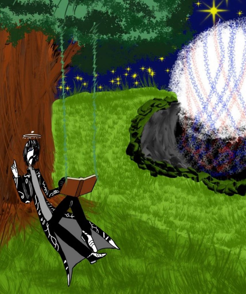
I made several sketches at the start. One idea I liked was a worker bee that could have been a background silhouette, flying to flowers or doing normal worker bee things. I also focused more on sketching the ant, as I am more comfortable drawing sharp and pointed shapes. I struggled with the caterpillar because it had a lot of round shapes, which made the process stressful for me. Because of time and story changes, most of my ideas were not used, but I still made sketches in my free time for fun and practice.

Sketches & character design from others in the group:

Other people in the group also made different designs for the ant and the caterpillar. We tried out multiple versions, including different body sizes, shapes, and accessories. In the end, we chose a design that stood out more, with the ant being short, angry, and wearing a scarf, and the caterpillar being big, round, and goofy, and carrying a backpack. The final design felt more clear and fit the comedic tone of the story.

Final design

Amy

Feedback

We received feedback from the teachers during the concept stage. Some designs and ideas were changed because they were not clear enough or would take too long to animate. We redesigned the characters several times based on this feedback. Even though this was frustrating at times, the feedback helped us simplify the designs and choose concepts that worked better for the animation.

ANIMATICS:

After the storyboard was approved, we moved on to animatics. Several people in the group made different animatics with different scenarios and endings. Some of them were red or yellow, meaning they were not clear enough. Only one animatic got the green light from the teacher.

We chose that animatic because it was clearer, funnier, and easier to understand. One person made the animatic that we used for the final animation. Once it was green lit, we were able to move forward into production.

Green lit animatics:

Favor

Other animatics:

Amy

Amy

PRODUCTION:

After the animatic was green lit, we moved into production. At first, everyone was given specific roles, but because of time management, we could not fully stick to them. If everyone stayed in separate roles, it would have taken much longer, so everyone had to pitch in and help where needed.

Several people worked on rough animation, outlining, colouring, and backgrounds across different scenes. Some focused on outlining characters and objects, while others worked on colouring scenes and backgrounds. One person mainly worked on editing in After Effects and also animated the backgrounds.

ROUGH:

Amy
Amy

OUTLINE:

Favor

COLOUR PALETTE:

COLOURING:

I mostly did colouring. I coloured the ant and the boat, especially the frames where the ant pops up from the boat with the stick. I did not colour the caterpillar. At first, I did not want to use the bucket tool because I disliked it and found it messy if a pixel was missed. However, when time was running out, I had no choice but to use it, and even though I still did not like it, it saved me time and I will use it in the future.

During production, I also screen recorded my colouring process and made a speed painting video including free copyrights music to the show the process, which I shared with the group. I also showed others in the group how to do screen recordings how they thought it was a great way to show their progress.

BACKGROUND & EDITING:

Vlad worked on editing using After Effects. He also worked on the background animation. The teachers gave feedback mainly on the background, especially the grass. They said the grass should move more like it is waving in the wind instead of slithering like a snake. This feedback was taken on board and changed during the After Effects stage so the background movement looked more natural.

All from Vlad

SOUND EDITING:

Sound was worked on by a few people during production. Olga mainly worked on sound compositing, using a mix of sounds that were recorded by Olga, Amy, and Elena, as well as other sounds. Amy voiced the ant, and Elena voiced the caterpillar.

I am not fully sure who did every sound, but I know that Olga and a few others worked on putting the sounds together. The sound design worked well with the animation and helped make it feel more lively and clear.

THUMBNAIL:

I made the thumbnail by myself during production when I did not have anything else to colour. It was my own idea and I worked on it solo. Instead of using Photoshop, I used Krita because it gave me more options with brushes and tools. Everything in the thumbnail was created by me, including all the textures and details, and I did not use After Effects at all.

The reflection in the water was difficult and frustrating to make. I used a mirror tool to copy the shapes to the other side, then coloured them. To make it look like water and not a clear mirror, I added another layer, lowered the opacity to around 50–75%, coloured it blue, and added textures so it looked like a lake. The process was a nightmare, but it worked in the end.

At first, I struggled with drawing the caterpillar because of the round shapes, as I am more comfortable drawing sharp and pointed shapes. When working on the thumbnail, I pushed myself to do it anyway. Even though it looked strange at times, I realised that I can also draw round shapes, which boosted my confidence.

Once I showed the final thumbnail to the group, they liked it, especially the water reflection. I then used it as the thumbnail for the YouTube video.

Made by me (Virgil-Pai)

FINAL VIDEO:

The production stage was stressful because of time pressure and changes, but everyone pitched in and worked together. We talked, shared ideas, and helped each other to avoid slowing the project down.

Credits:

Animators: Amy, Favor, Olga, Vlad, Elena (El), and Virgil-Pai

Characters: Amy, Favor, and Elena (El)

Background & Editing: Vlad

Sound: Amy, Elena (El), and Olga

Thumbnail: Virgil-Pai

Feedback from peers:

Strengths

  • Strong voice acting and sound design
  • Smear frames and animation motion are very well done
  • Feels very Looney Tunes–style and nostalgic of classic cartoons
  • Bouncy, fluid animation with clear actions
  • Characters are cute, squishy, and full of personality
  • Great character expressions and contrast between the duo
  • Comedic timing, gags, and pacing work really well
  • Perspective changes and camera work are effective
  • Warm, lively atmosphere and appealing art style
  • Narrative pacing is tight and engaging
  • Clear storytelling and easy to understand

Improvements

  • Watch out for cropping in some shots
  • Some scenes could benefit from slightly wider framing

Final Thoughts:

Out of Your Head was an interesting group project to be in. We worked together well in developing the story, designing characters, storyboarding, creating multiple animatics, and eventually completing our final animation. During production, we learned to collaborate in the animation process, taking roles on who would be doing the roughs, outline, colouring, and editing. 

At the start of the project, I felt nervous because it involved working in a group, and I am very shy. However, I slowly became more comfortable interacting with my team and gained confidence in talking, sharing ideas, and being part of the group. Even if I only shared small ideas, I still contributed to character creation and animation decisions. I learned that working in a group means making compromises so everyone can agree. Although this was sometimes difficult, it helped the project move forward.

One thing I learned about collaboration is that people can share knowledge and strengths. For example, I showed others how to use a Mac for screenshots and screen recording, and they helped me with colour choices. This showed me that teamwork is about supporting each other and working toward the same goal. I now feel braver about joining groups and sharing my thoughts.

As a team, we explored different concepts before deciding on the insect story with two characters that had different personalities and sizes. I enjoyed collaborating with creating character designs and developing the concept. We communicated well, especially during group calls where we solved editing problems and shared ideas. Our team’s strength was creativity and cooperation, while our weakness was organisation and time management when sharing files.

Overall, this project was challenging but rewarding. I feel proud of the final animation and happy that I was part of the team. It helped me see that collaboration can be positive, creative, and enjoyable, and it encouraged me to keep experimenting with difficult things and pushing myself in future projects as well as looking to work with others.

Production Principles – Stop motion

In this rotation, I worked together with 2 other students (Christine and Valentina) to create a stop motion short film. This was an analogue exploration of creating a movie using stop motion.

The aim of this rotation was to be introduced to stop motion animation using the software Dragon Frame. We were asked to create a puppet and explore how to manipulate puppets to create movement. Overall, the aim was to learn basic stop motion techniques.

The main theme of the stop motion project was metamorphosis or transformation.

We also learned about replacement animation, which is a stop motion technique where different parts of a character are replaced frame by frame instead of moving one single puppet. This includes swapping parts like heads, faces, or limbs using materials and sometimes magnets to allow precise changes in movement.

WEEK 1:

In week one, the focus was on exploring materiality, which means using and experimenting with different materials to create characters.

We built a puppet and then practiced how to manipulate and move it for stop motion. This helped us understand physical movement and how transformation can be shown through materials and puppet animation. The idea was to create a puppet that could be manipulated by 2-3 people.

We designed and built our puppet using cardboard, and we chose a dog as a concept. We only used recycled cardboard for making the puppet, which is in line with creating art in a sustainable way, rather than using new products.

The dog was made entirely out of cardboard. We peeled the skin of the cardboard to create texture and fur. The cardboard was torn, cut, folded, and crumpled to make it more flexible and easier to move. Folding and crumpling helped the limbs move without being stiff. The legs were designed so fingers could fit through them, allowing movement during animation.

I was responsible for creating the front legs for the puppet, the other two made the head and the main body of the puppet. Once we had everything, we began experimenting with Dragonframe, to explore and practice how to manipulate and create a narrative.

Video:

Reflection: At the start of week one, working in a group felt confusing and awkward, and I was quite shy. After some time, I became a bit more confident. I think working in a group is good for stop motion because it allows people to share ideas and collaborate on character design. Instead of one person deciding everything, everyone can suggest ideas about how a character should look, such as its shape, colour, or features, and give feedback to improve the concept.

Working in a group also helped with sharing responsibilities. Different people could work on separate parts of the puppet, which made the process easier. I enjoyed making parts that could actually move, especially the legs with joints. Even though they were not fully used in the animation because they broke, I still enjoyed designing and building them.

I also learned about sustainability and really enjoyed using recycled materials. I prefer using found or old materials instead of new ones, such as things from a toolbox or around the house, and then manipulating them to create characters. I like materials that feel unusual or slightly uncanny. In my past work, I have often used metal because it makes characters feel dangerous or like they should not be touched. However, depending on the character, different materials are needed, such as paper or cotton for something softer.

I found replacement animation interesting, especially as part of mixed media work. It can be useful for difficult movements like mouths, fingers, or hair, which are hard to animate in stop motion. In the future, I could use replacement animation together with digital animation to make these movements easier and more effective.

Video: Righteous Robot

Righteous Robot, is a stop motion animator that uses frame by frame replacement for mouth motion. For example, he made a dialogue video that explains how he made video and how he used the replacement technique.

WEEK 2:

Our task was to design and create a 30 second stop motion animation, using our puppet and include a transformation or metamorphosis sequence.

The animation is about a dog that starts off falling apart. Each body part acts on its own, like they don’t want to be part of the same body anymore. The legs try to walk off and play, the head gets frustrated trying to lick a bottle, and the body wanders around bumping into things. In the end, the body parts find each other again and rebuild themselves, becoming whole once more. The transformation shows the idea of wanting to be together instead of being separated.

How we made it:

A hot glue gun was used to hold the joints together. The fur was added gradually during the animation instead of all at once, using small amounts each frame. Only half of the dog was fully covered, and the puppet was angled so the unfinished side was less visible. The focus of the project was material transformation, and the story developed naturally while making it.

We made the background fully black so we could hide our hands using dark clothing. The puppet was kept light, so it stood out from the background. Two people moved the puppet while one person operated the camera, which was connected to a computer. Some of us used black gloves, and others covered their hands with dark materials like tape or sleeves.

The puppet could not stand still, so we had to move it very slowly while the camera took photos. The camera was timed to take one photo every second, instead of moving the puppet and taking photos separately. There were a lot of frames, too many to count.

We used Dragonframe to control the camera and capture each frame. It is mainly used for stop motion and helps the camera take photos smoothly. For editing, we used Premiere Pro, but only for sound. We did not change the movement because it would make the animation look choppy or slow. There was no detailed storyboard. Ideas came up during the process and were decided together, like using the bottle. The animation was done in one go for each scene, but we had to stop and continue on different days because it took a long time. Each scene was animated separately and then put together in the edit.

Final video & screenshots:

Reflection: For week two, I feel happy with how the final video turned out. Making it was silly but very long and tiring because stop motion takes a lot of time. We had to stop constantly, move small pieces, and take photos frame by frame. Holding the puppet in place was painful sometimes, especially since parts were not supported and had to be held by hand. Even though it was frustrating, we managed to make it work in the end by gluing everything together, which was fun.

The editing part was difficult, mainly because we struggled to find sounds that worked well with the animation. I still enjoyed the process, but it was rushed due to the lack of time. Working in a group helped a lot because it sped up the process. Doing this alone would not have worked, and the animation would have been much shorter or unfinished.

Timing was one of the hardest parts. If we moved the puppet too fast, the animation looked wrong and unnatural. We had to slow everything down so movements lasted a few seconds instead of happening instantly. This helped the animation feel more readable, even though some movements still looked a bit jerky.

The concept was simple because we had very little time. We chose one idea and stuck with it: a dog made of separate pieces trying to come back together. I am happy with the concept, and I think it worked well for the short time limit.

Sustainability was very important in this project. We only used recycled materials like cardboard and old pieces, instead of buying new materials. This is something I already enjoy, as I like collecting found objects and using them to build characters and backgrounds.

Overall, the experience was confusing and frustrating at the start, but also funny at times. I still do not enjoy doing stop motion because it takes too long, but I like working in a group and making puppets. In the future, I would prefer to collaborate by contributing digital or 2D elements or using replacement animation alongside stop motion rather than animating everything physically.

Production Principles – Animatics

In this rotation, I learned the difference between a storyboard and animatics. I learned how to turn storyboard into animatics. A storyboard is a static blue print where an animatic is the video version of the storyboard. Watching the animatic from the movie ‘UP’ helped me understanding the difference.

We were given a few ideas with different plots. I chose to create a BAR Dispute scene. I wanted the story to be about discrimination against people and not to mess with them.

I am used to creating storyboards but I struggled to create the storyboard as an animatic.

The Script:

Below is my initial script. I started by using sticky notes, but I initially struggled with this process. We were given the option to write down the story or use sticky notes. I found writing the story was easier for me to process my ideas at first. This was also a short project, and because of time, I decided that for this step, I would write it down.

  • Somewhat busy day in the bar cafe.
  • 2 people sit down and drinks (coffee or other drinks).
  • Blaze serving the other customers and talking to his friends.
  • The 2 people causing a seen lying about the drinks being bad and threatening by knife point.
  • The first person swiped at Tox who was going to attend to a different customer.
  • Tox mask cracked, then she looks at the first person with a piercing stare and slowly pull out a bone saw out of her medical bag.
  • The 2 people back away and bump into Zal who is towering over them.
  • They swing around to strike Zal, but he grabs their arms and crush their wrist making them drop their knives.
  • Blaze picks the knives up and melts them.
  • The 2 people cower as the 3 look down at them with big deadly smiles.
  • It goes black, then the bar cafe returns to normal? (The 2 people either dead or having a horrifying night)

BAR DISPUTE SCENE – VERSION 1:

Digital Storyboard:

This is my initial storyboard. I found drawing my storyboard digitally easier as a process here. I designed the storyboard on my tablet using an app called ibisPaint X. The general I received from my tutors feedback during this process was to add more frames with different angles, close ups and wide angles to make the story clearer.

Animatics:
During this rotation, I learned how to use Premiere-Pro to edit my animatic. This is a process I enjoy doing and I find Premiere-Pro fun to use when editing stories.

Feedback from teacher and peers:

  • Take time to think through the steps of the story. Slow it down. There needs to be time to process what’s happening.
  • Film language could be clearer. It needs to be easy for the viewer to understand the plot.
  • Bring the characters into all scenes of the animation, even scenes that are establishing shots.
  • The black scene at the end could be an indicator of the passage of time.
  • Next look at your animatic and pace it out better – change the timing of each panel so that it tells the story better – make sure the panels are not all the same length.
  • Good approach – that you distinguished between colours – that was really clear.
  • Good idea that you added yourself into it

BAR DISPUTE SCENE – VERSION 2:

Following the feedback, I added several frames to bring the characters into all scenes and tried to make them more active in order to make the plot easier to follow. I made some of the frames longer and others shorter to improve the pace. I also removed unnecessary frames to make the story shorter and easier to understand. I added a soundtrack using props, for example slamming on a table, cutlery dropping, and bones cracking. I also used music and other sounds downloaded from free-copyright websites. I think this made it clearer to the audience. However, if I had more time, I could have added speech bubbles or captions to make the plot clearer.

Digital Storyboard – Additional frames:

Animatics:

Feedback from teacher and peers:

  • Good, strong, establishing shot – improvement from last time.
  • Good zooms that help the pacing speed
  • Maybe take a few shots out 
  • Sounds make it easier to understand
  • Lost at some point with the plot
  • Maybe some help understanding the characters and the story
  • Difficulties: Slowing down the scenes is hard. Lack of time.

Personal note: Fort this project, the feedback was helpful at first, but the more I received feedback, the more stressful, confusing and frustrated I became. For example, the previous feedback was to make more animatic frames, the animatic shorter and then, make the animatic longer, or another make the animatic easier to understand.

Staging in Animatics:

Alan Becker is one of my favourite animator and he has made video tutorials of the 12 principles which I find very easy to understand. For animatics, I watched his video on staging which helped me understand the feedback I was given better.

Personal Reflection:

During this process, I first struggled with understanding the difference between animatics and storyboards. I had to do some research to fully understand how they are different and how each one is used.

My original concept was about discrimination. This idea was important to me, but due to limited time and feedback that was sometimes confusing, it did not fully come through in the final animatic. As I worked on the project, I had to focus more on making the story clearer rather than fully developing the original concept.

I struggled with time management, which affected the editing process. However, the final animatic improved after I added sound effects and background music. I especially enjoyed the editing process, particularly sound editing.. Feedback helped me understand the importance of clarity and pacing, and my animatic improved after I followed the feedback. However, I was still unhappy with the result because the pacing was confusing in places and there were too many frames. I also did not have enough time to improve the drawings or the editing by adding captions or speech bubbles.

Overall, the experience was challenging but useful. It helped me understand the importance of clear storytelling, strong pacing, careful staging, and realistic planning when working within a short deadline.

Introduction to Animation – Elephant & Castle

Brief: Imagine an origin story of how The Elephant & castle might have got its name. Create a “book” that tells that origin story. the only rule is to have an element of movement.

My concept: Create a stop motion picture book using paper cut outs. It tells the story of a baby elephant that lost its herd. Years go by and its mother found him and they are finally reunited.

My process:

This was a group animation project, but I didn’t have a group when I started UAL. Because of my neurodiversity, it was difficult for me to find and speak to the other students. This reflection is about how I made this animation by myself. I made this animation using a mix of a stop motion picture book animation, by drawing the elephant and environment on scrap plain paper and then cutting around the drawings afterwards. For the editing, I didn’t know how to use Premiere Pro yet, so instead I used a different software called iMovie. For the beginning and end of the animation, I recorded a stack of paper to make a flipping-through-pages effect, to make it feel like the animation itself is travelling through a book.
(The flipping-through-pages idea was inspired by the animator Gildedguy from YouTube. In most of his animations, he starts with a flipping-through-pages animation.)

Storyboard:

Video editing: iMovie

Video:

Personal Reflection:

I found the start of this project very stressful, because at first I was not clear on when this was supposed to be handed in. At the beginning, I also struggled to find an idea for the story, because we were not allowed to research Elephant & Castle. Then, through sketching a storyboard and brainstorming, I stuck with the storyboard and made it into the animation as a stop motion. I like the flipping of the pages and the movement it creates, and the feeling it gives that you are entering the story of the book. If I had time, I would have added sound to it.

Time management was the main issue for this project, as well as connecting with the brief and finding a story. However, it made me realise that when I am stuck with finding ideas, the best way is to draw anything that comes into my mind to start shaping a story. A little bit like an abstract painting that can become an idea.

Inspiration: Page flipping

From 00:00 to 00:07 – Book flipping

Introduction to Animation – ‘Anger’

Concept overview:
Anger is an abstract look at what it feels like to be completely overwhelmed by rage. The main idea is to visually show how isolating and explosive intense anger is. It feels like a huge pressure inside that has to get out.
Synopsis:
An asteroid falls from the sky and crashes to the Earth. An alien crawls out of the crater and wanders around. Then a rock falls on its head, triggering anger that turns into a total meltdown. The alien starts running and destroying everything around it. It then completely goes out of control in a full spiral before vanishing.

Video:

Artist’s statement:

Anger is an abstract metaphor for overwhelming rage. It explores how isolating and explosive intense anger feels: an extreme internal pressure that, once out, leads to destruction. Although the design is abstract and non-human, I used key animation rules to make the emotion feel real. This project, inspired by the Uncanny Valley discussed in the stop-motion lecture, explores how rage can be communicated without words.

I used Krita for its range of tools and brushes. Rather than drawing defined forms, I worked using soft and rough strokes, allowing shapes to emerge through movement. This emphasised the emotional state and helped make the animation feel unsettling through distortion. Emotion is communicated purely through sound, movement, colour and shape.

The main challenge was depicting anger in its simplest, most abstract form without relying on familiar facial expressions or emotional poses. The raw look draws from the idea of making the abstract experiential. The creature embodies anger and acts as a substitute, allowing the audience to feel the rage.

Its movement is intentionally unnatural, inspired by the kinetic biology seen in the Edge of Tomorrow or A Quiet Place. Its motion is both fluid and jagged, symbolising the volatile nature of intense anger – the eerie calm before an outburst versus the painful, aggressive reality of the explosion.

Metamorphosis is the central visual tool. The creature never holds a fixed shape, beginning as a loose, fluid form before compressing and expanding into a destructive solid state. This reflects the feeling of being “transformed” by rage. As Paul Wells states, transformation is the “constituent core of animation itself” (Wells, 1998). The creature cannot hold its form because there is “too much rage in one body.”

Peter Millard’s Bomb (2014) influenced my use of an unpredictable, messy, janky style. Although the creature avoids human realism, its unstable movement creates eeriness—something familiar in a completely alien body.

This is a deeply personal expression of anger: an intense experience of when “words don’t suffice”, and a creative process aimed at getting the anger out of my body and onto the screen.

Through this process, I gained a deeper understanding of how abstract movement and form convey emotion, and I plan to develop these ideas further. If developed further, I would push the abstraction by using unconventional viewing angles to increase instability.

Creative process:

Mind Map:

Colour symbolism in emotions:

Colours are always part of my animation and art process because colours are tied to emotions, and they are important to me when I create characters. In this case, I want to create an animation that shows what it feels like to be angry. This is very personal to me, as I have trouble expressing my emotions properly. I always think about emotions in colours. Different cultures use colours with different meanings and symbolism. Anger is most commonly symbolised by the colour red, which also represents blood, fire, danger, and rage. Black is another colour that can represent intense anger, mystery, or the unknown. In India, for example, black can represent evil, negativity, and a lack of energy. In other contexts, it can be a powerful accent colour. My plan is to use both of these colours in my animation to underline the power of my character’s anger and rage.

Why Links Between Colors and Emotions May Be Universal | Psychology Today

BOMB BY PETER MiLLARD

I like the messy and violent feeling when watching Bomb by Peter Millard. The sudden changes in the character’s shapes and the immediate disappearing of those shapes make me think about how rage appears suddenly before disappearing. It also feels unstable, which is how I want my character to feel.

Moodboard:

The concept is a meteor falling from the sky and crashing onto the earth, revealing an amalgamation of two creatures in one, inspired by the Death Angel from A Quiet Place and the Mimic from Edge of Tomorrow. I want the creature to have the feel and movement of the Mimic while keeping the Death Angel’s aggressive movement. I also want the creature to move like liquid metal and then transform into a solid form when enraged.

The Death Angel from A Quiet Place

The Mimic from Edge of Tomorrow

Sketches:

Storyboard:

The storyboard starts with an empty frame, then a meteor falls from the sky and crashes into the earth. It doesn’t feel like a smooth animation — it looks like something that suddenly slammed into the ground. The camera snaps or zooms in, like someone observing the crash site, trying to see what’s there.
A creature emerges from the crater. It isn’t animated smoothly; it twitches and glitches out. Each frame feels scribbled and abstract, making it feel unnatural, like an amalgamation — a creature that shouldn’t exist or be here. Its movement is wrong and unsettling.
The creature crawls out of the crash area in an awkward, unnatural way. Its fingers twitch, its body moves strangely, and it looks around while walking at the same time, as if it has multiple faces or heads reacting at once. As it wanders, a rock falls and hits it directly on the head. The camera zooms in, switching between the rock and the creature’s face.

There’s a pause, like it’s processing what just happened. Then it becomes enraged, almost like a tantrum exploding out of nowhere. Its movement is not like an animal, insect, or anything recognisable. It doesn’t walk or run normally. Everything about it is abstract, unnatural, and unsettling, focusing more on emotion and feeling than realism.
This internal turmoil is visually externalised when the creature’s face splits open, depicting the sensation of being “split apart” by overwhelming rage – a visual substitute for internal screaming or an explosion from the inside out. The creature’s subsequent chaotic charge reflects an uncontrollable expulsion of this internal pressure, an effort to externalise an unbearable “too much rage in one body.” This constant state of metamorphosis underscores the creature’s emotional and physical instability.

The sequence culminates with the creature self destructing and disappearing.

The animation uses a monochromatic colour scheme to show anger, mainly red or dark crimson. Different tones, shades, and tints of red show movement, emotion, shadows, and possibly glowing. Black or grey is added to give it a rocky, almost liquid rock appearance. The creature feels like it’s from another world, abstract and unnatural.

Production in Krita: showcasing use of brushes

Contact Sheet:

Bibliography:

Uhrig, M., 2018. Emotion in Animated Films. New York: Routledge, pp.39–58

Uhrig discusses how animation represents emotions in unconventional ways through audiovisual metaphors, such as personifying emotions as animals. Similarly, I explored this by creating an inhuman creature with unnatural sound as a metaphor for anger.

Wells, P., 1998. Understanding Animation. London: Routledge, pp.59–68.

This chapter discusses experimental versus traditional animation, particularly the Uncanny, as described by Freud, which blurs the line between the imagined and the real. I explored this by presenting a familiar human emotion in an unfamiliar, non-human form to create discomfort.

Wells, P., 2008. The Animated Bestiary: Animals, Cartoons, and Culture. London: Rutgers University Press, pp.64–76.

Wells discusses using animals to represent human characteristics and describes metamorphosis as a way to show changes in space, time, and existence. Similarly, I used the transformation of an abstract creature to illustrate emotional change through metamorphosis.

References:

A fireball (n.d.) [Online image]. GeologyIn. Available at: https://www.geologyin.com/2016/09/huge-meteor-crashes-to-earth-as-flash.html (Accessed: 10 December 2025).

Bomb (2014) [Film]. Directed by P. Millard. UK.

Cecepbinsae (n.d.) Red abstract background. [Online image]. Freepik. Available at: https://www.freepik.com/free-vector/red-abstract-background_42646550.htm (Accessed: 7 December 2025).

Garzilli, A. (2022) Why links between colors and emotions may be universal. [Online article]. Psychology Today. Available at: https://www.psychologytoday.com/us/blog/color-psychology/202202/why-links-between-colors-and-emotion (Accessed: 7 December 2025).

How do the mimics in Edge of Tomorrow reproduce? (2023) [Online forum post]. Reddit. Available at: https://www.reddit.com/r/scifi/comments/17dz33p/how_do_the_mimics_in_edge_of_tomorrow_reproduce/ (Accessed: 10 December 2025).

Kushnaryov, P. (n.d.) Abstract chrome metallic shapes flow smoothly, shiny glossy liquid metal. [Online image]. Dreamstime. Available at: https://www.dreamstime.com/abstract-chrome-metallic-shapes-flow-smoothly-shiny-glossy-liquid-metal-c (Accessed: 10 December 2025).

Paramount Pictures (2024) A Quiet Place – Death Angel. [Online image]. Entertainment Weekly. Available at: https://ew.com/everything-we-know-about-the-creatures-from-a-quiet-place-8674939 (Accessed: 10 December 2025).

Rugged stone texture (n.d.) [Online image]. Stockcake. Available at: https://stockcake.com/i/rugged-stone-texture_119450_12288 (Accessed: 10 December 2025).

Characterflux – Breaking Character & Making Character

BREAKING CHARACTER

Breaking Character was about exploring how to show emotion and personality through movement instead of dialogue or detailed facial features.

ORIGINAL IDEA

My original idea was to create a bird character using collage materials, but it became too complicated to animate because of the number of moving parts.

Concept 1:

Concept 2:

I wanted to use these two triptych concepts but realised they were going to be difficult to animate and too time consuming. I scrapped the first, but kept the second concept on animating a bird instead, as they were easier and more fun to experiment with, sketch and animate.

BIRD: Character Creation, Expressions & Turnaround experimentation

I focused on studying bird behaviour, especially pigeons, and how they express emotions through head and eye movement. I also explored the tilting of a head and expressive emotion through facial expressions and body language to show what my character is expressing instead of using plain expressions.

For example, a head tilted downward can show sadness or depression, while tilting the head backwards can suggest boredom or sleepiness. Shaking the head can feel nervous or scared, and stretching the head forward can show surprise or shock. I used these movements to experiment with expression before designing my final character.

ROOK: Character Creation, Expressions & Turnaround experimentation

  • Initial idea for Rook: My initial idea started with birds, especially pigeons, because they are easier to use to show emotion through movement. The pigeons were mainly used as experiments to study head tilts, eye direction, and body language. From this, I wanted to create a more serious and stronger character, which later became Rook.
  • Design process for Rook: Rook’s design developed slowly through sketches and experiments. He changed from an early idea into a more snake-like, sharp-looking bird. I focused on shape language, making him sharp and pointed to contrast with the pigeon’s softer and rounder design. His character traits were stern, cunning, and guarded, which influenced how he looked and behaved. The name “Rook” came from chess pieces, as it was the first name that came to mind and felt strong and fitting for his personality.
  • Background story:
    Character Development: Stern, Cunning, Guarded
    The character is a stern creature that prefers to be left alone. He is unlike any of his kin, as he likes to sleep and hunt alone. Because he’s protective for his own survival than any of his kin, and he dislikes any humans that disturbs him (for example documentary or human technology). He likes to be curled up into a ball when sleeping, if he’s on the ground he would slither up on trees and jump off to help him get enough height to let him fly. His wings are made of a tough scales that can protect him from other predators and he can use his wings to dig through tough rock or dirt. He is quite intelligent, as he can find materials in many locations and use them to make tools, traps and equipment to help him survive alone.

Feedback from peers and teachers:

The feedback I received was mostly positive and focused on character exploration. Jess said she really liked the personalities of both the pigeon and Rook, and that the differences between them were very clear. She felt they came across as separate characters with different emotions and ways of being, which is what the project was looking for.

The feedback also mentioned that the design choices worked well, especially the contrast in shape language. The pigeon had a softer, rounder, and more fluent appearance, while Rook looked sharper, more aggressive, and more guarded. This contrast helped communicate their personalities clearly.

Overall, the feedback confirmed that the emotions and personalities were readable through body language, movement, and expression, rather than just the drawings, which showed that the concept was successful.

ROOK: Motion Plan

My general idea for the motion plan is for Rook to start curled up and guarded, appearing vulnerable. As he wakes up, his expression is stern before becoming alert and slightly surprised. His cunning is shown through how he quickly reads the situation and realises the danger is too big for him to handle, choosing to fly away instead of reacting aggressively.

I plan to use Squash and Stretch only on the eye to show disbelief and surprise. Anticipation will be shown through the eye movement, where he will open his eyes, look in one direction, close them, then open them again before reacting. I will also use Anticipation by slightly jerking his head before unfolding and flying off. I will use Staging simply by placing Rook in the centre of the screen on a tree. I plan to use Arcs mainly for the wings, with Rook flying out of the screen and moving in curved, natural motions rather than straight lines. For Timing, my plan is for each body part to move at a different pace, with slower unfolding and more majestic wing movement.

ROOK: colour palette

For my colour palette, I used various colours, but most of them are used through shading. Rook’s head is a dark grey, while the main body and wings are brown. The underbelly uses a lighter skin-tone colour, with bright yellow lines inspired by a snake’s underbelly to make it textured. I am happy with the colour choices for the whole body, as they help Rook feel like a mix between a bird and a snake, even though I could have pushed the design further.

For the eye, I focused on making it stand out. I used a black pupil, red rings, a yellow iris, and small purple lines for detail. I enjoy designing eyes, and I wanted Rook’s eyes to feel unique and expressive, as the eyes helps define the character’s personality.

Personal Reflection:

Overall, my experience with Breaking Character felt fun and enjoyable. I liked that I could use any material to create a character, like junk, mixed media, or collage, instead of only drawing. When we were given the materials, I felt confident because I had made characters from recycled materials before. It felt easier and more fun to start by making something physically, then later turn that into a 2D character.

I enjoyed the process of creating something without fully knowing what it would become, then letting that inspire the drawing. This process helped my creative thinking feel more controlled and helped me visualise characters before putting them on paper. Learning about birds, especially pigeons, really helped. Studying their head tilts, bobbing movement, and expressions made things click for me and pushed me towards creating Rook.

Rook’s design changed many times because I kept thinking about how it would work in animation. I kept redesigning his head until it felt clear and readable from different angles. I am happy with my final drawing, especially the eye design, as it gives him more personality. I also chose stronger, colder colours because I did not want him to stand out too much or look overly colourful.

Through this project, I learned that you do not need to use all 12 principles of animation, only the ones that fit the character and motion plan. This is something I would use again in future projects.

MAKING CHARACTER

The aim of the rotation was to bring our characters to life. Following the motion plan and the 12 principles developed from Breaking Characters, and create an 5-8 second animation, using Photoshop.

What I did:

I planned for Rook to start asleep, curled up and guarded, then slowly wake up and fly away using different animation principles. My plan wast to use Squash and Stretch only on the eye, Anticipation through eye movement and a head jerk, Arcs for the wings, and Timing where each body part moved at a different pace.

In the final animation, I only managed to use squash and stretch on the eye and some anticipation when Rook opened his eyes and reacted. The staging stayed simple with Rook centred in the frame. However, I struggled with timing and my animation was too quick, especially when Rook unfold himself before flying off. I could not fully use arcs or timing as planned because all the body parts were in one frame and I did not have enough time to separate them.

Final Video & screenshots:

Feedback from peers:

  • Rook is rounded and curved and then unfolds and unwraps and the shapes are convex and the contrast is good and makes him look more dynamic.
  • We like to expressions and anticipation of it getting up to fly.
  • Very expressive well animated eyes.
  • The design, the sharpness of the head feels stern. The characteristics come through really well
  • The beginning furled up pose feels very guarded and the eyes feel cunning
  • Rook starts off vulnerable whilst asleep, but then you see the sharper shapes and, guarded, cunning character come through.
  • You chose a hard perspective to do the flying pose from, but the way that the character comes out of the screen is really well done and you can see you put a lot of thought and work into making it smooth.
  • You responded to feedback well and made the head move well and added more emotion and detail to the eyes, squeezing. Eye movements are good.
  • The downward curve of his mouth makes him look stern and serious, but perhaps you could make the neck/mouth shape easier to understand anatomy wise.

Personal Reflection:

Overall, I am happy with the final outcome of my Making Character animation. I wish I had more time to fully finish it, especially adding colour and sound, but for the limited time, it works well on its own. I really like how the animation feels, particularly the wings. They are slow but smooth, which makes it feel almost like slow motion.

The process was mostly okay at the start, especially animating the body and head. The most difficult part was animating the wings, as they looked unnatural at first. With help and feedback from a peer, I learned how to use curved, rippling movements, which improved the animation a lot. This showed me that collaboration can be really helpful.

My concept changed during the process, and I did not fully follow my original motion plan, but the final idea still works. I used some of the 12 principles of animation, such as squash and stretch, anticipation, arcs, and timing, mainly in the eye, head, and wings. From this experience, I learned the importance of feedback, time management, and choosing animation principles that fit the character. I will use this process again in future projects to make my animations more expressive.