BRIEF:
The brief for Sonic Vision was to create a 30-second sound first, before making the animation. It had to be exactly 30 seconds, not more.
At first, I thought we were going to use our own sound for our own animation, but actually we had to make our own sound, give it to someone else randomly, and then use a random person’s sound to animate.
We were also encouraged to be playful and experiment with the sound.
MY SOUND:
PROMPT:
The prompt I chose was “by the skin of my teeth”, and I decided to make it more horror and suspense based. I was inspired by A Quiet Place, thinking about how being quiet feels safe but sound makes it scary. I imagined a character alone in an empty house, with sounds like ticking clocks, water dripping, and a fridge humming, but then something starts crawling and scurrying around, building tension.
PROCESS:
For my process, I used objects around me to create sounds. I did knocking in sets of three, typing on a keyboard for crawling, used a lanyard for wind chime sounds, and opened and closed a headphone case for clicking sounds. I also added a fridge hum to make it feel more like a real home. I used Adobe Audition and Premiere Pro to edit, change pitch, volume, and pan sounds from left to right to make it feel more 3D. I mostly experimented because I wasn’t fully confident with the software.
FEEDBACK:
The feedback I received was that my idea was strong and open to interpretation, but I needed more ambience and more layers, and to experiment more with space. The sounds were good but a bit monotone, so I needed better mixing and more dynamic sound. I was also told to build it up to a climax and have a better ending, like a fade instead of a sharp cut.
REFLECTION:
I did enjoy the process, especially mixing and changing the sounds, but I struggled with time management and keeping everything exactly 30 seconds. I tried to follow the feedback by adding things like the fridge hum and panning, but I couldn’t experiment as much as I wanted. I am happy with my final result, but I could have improved it by adding more wind, better ambience, and adjusting the timing of the sounds more carefully.
SOUND GIVEN FROM OTHER STUDENT:
MY FIRST IMPRESSION:
The exercise was for everyone to create a soundscape and then exchange it to other students through Padlet, where it would be randomly selected. My first impression on the soundscape I was given was terrifying and horrifying. The first sound made my skin crawl and gave me a flashback of being horrified from a video game. The chains sounded like something crawling behind me or gates opening. The heavy breathing confused me because it was very long, like someone running for a long time. Then there was loud thunder and explosions, which made me think of danger or escaping from something. The splashing sounded like someone diving or drowning. At the end, the music box felt calm but also strange and mystical, which made me question why it was there.
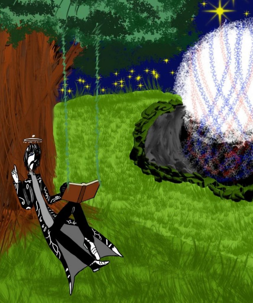
MY CONCEPT:
Because all the sounds just sounded like a whole thing, I decided to explore a horror thriller. I first thought about a war zone, but it would have been too difficult and too long, so I didn’t want to do that. Instead, I focused on the main character escaping from something dangerous, like a creature. I was thinking about chains, thunder and water, and the only thing that popped up was an abandoned port or a factory near water, so I stuck with that. I also wanted it to be more horrifying or thrilling based on the sound. The music box made me think of creating a creature that looks horrifying but has music coming out of it.
MOODBOARD:
I started to create my moodboard by thinking about the sounds I heard, like chains, thunder and water. I focused on abandoned places that are closed off and no one is allowed in. For the thunder, I didn’t want to show lightning striking directly, but instead have flashes of light coming through a window. For the explosion, I looked for something like a nuke explosion. For the splashing, I used waves hitting the side to create that effect. For the drowning, I found an image of someone falling into water. I only used Pinterest for my research, because I couldn’t find the right or comfortable images on other websites like IMDb or ShotDeck, so I just used regular imagery from Pinterest.
SKETCHES:
I first drew silhouettes of both the creature and the main character on Photoshop to play around with ideas.
LURKER:
I called the creature the Lurker. It became something like a walking music box with music coming out of it. I didn’t do many poses for the monster because I had limited time.
MC:
For the main character, I sketched different poses like running, falling and drowning.
RUNNING
PANTING
LOOKING AROUND
FALLING
DROWNING
PANICKING
MOODBOARD ANIMATIC:
I used Premiere Pro to create the animatic because I wasn’t at the After Effects stage yet. The animatic shows the main character running from the creature, explosions happening, and eventually falling into water and drowning. At the end, the music box plays and then cuts off.
REFLECTION:
I wish I had more time. My time management was not good and I had to rush parts of the work. If I did it again, I would plan better, manage my time properly, listen to the sound first, and make a storyboard before starting. The sound complicated my thought process, so I had to improvise a lot.
BACKGROUNDS:
After the mood board animatic, I started making my backgrounds for the animation. I followed the images I used for the moodboard as inspiration, not copying them but making something similar to the environment.
I decided to have the main character run through an abandoned factory or port. For each background, I focused on the colour and environment. I first made the layout on my iPad using Ibis Paint, using the grids and shapes to help me draw straight lines and build the environment. Then I exported them to Photoshop and painted over them using warm colours to give a worn down, rusted, oxidised look, like metal turning red or green with moss growing.
I made different backgrounds like the start, a small room with a gate, a hall, a main hallway, and a window view. All of them keep the same rusty, murky, creepy atmosphere, with broken doors, pipes, and closed spaces. I didn’t focus on making them perfect, just quick backgrounds to support the animation.
At the end, I realised some backgrounds looked too much like a boat instead of a facility.
START
GATE
MAIN HALL
HALL
WINDOW
FEEDBACK:
The feedback was to use photo bashing, meaning blending multiple images together instead of drawing everything. I was told to simplify things and not overcomplicate it. They suggested using textures and overlays to fake backgrounds instead of making everything from scratch, and to use lighting like flashes.
BACKGROUNDS – PHOTO BASHING
For the last 10 seconds of the animation, I followed the advice to use photo bashing. I found a image of a catwalk above the water and quickly made the background by photo bashing over it, which made my process much quicker.
My process was to take one image and crop around it. After that, I coloured over it with a little bit of green and made it foggy so it looks like a murky background. You can still slightly see the real image mixed with the colour. This was to make fog only.
I learned that photo bashing is not the same as collage. It’s similar, but you use images from different images, cutting pieces and putting them together to make one image. It is quicker and practical to create a background and helps with time management.
I used Photoshop for the backgrounds because I wanted to make this quick. I didn’t experiment with After Effects because I didn’t have time, but I will probably use After Effects in my next elective.
Photo bashing helped me with time management and helped me finish my animation. I would use it again if I want to make a background.
ANNOTATED ANIMATIC:
MY PROCESS:
After I created my backgrounds, I then did an annotated animatic. I first made rough sketches of the characters to show actions like running or crawling. I did this directly in Photoshop, on top of my backgrounds.
I followed my moodboard animatic and also the sound from that. I didn’t copy it, but I used it as a reference.
I used colour coding so it wouldn’t be confusing. Green was for the characters and their actions, showing where they start and where they end. Blue was for arrows and text to explain what is happening, like where the character moves or when the entity emerges.
I used rough drawings because if I drew them properly, it would have been a mess and taken too much time. I wanted it to be an annotated animatic plan. Without it, I wouldn’t know where to start or where to end. It helped me plan and time my animation before doing the final animation.
I prefer doing this instead of a storyboard on paper because if I did that, I would come back and change too many things, get confused, and be more stressed. Doing the annotated animatic on top of my backgrounds helps me visualise everything better and makes more sense to me. It is more efficient and more comfortable for me. I used a similar process before and it worked well.
Camera and Visuals: I didn’t use zooms or cuts. I used different camera angles depending on the action, like overhead views, front views, and low, crooked angles to create a weird perspective.
ANNOTATED ANIMATION:
FEEDBACK:
On the last day, I showed my work to both teachers and student, and got positive feedback. People said they understood the story and liked the camera angles.
The person who did the audio said they didn’t expect a creature, but the audio was confusing for me, especially the explosion and other sounds, so I interpreted it as a port environment. It showed that everyone has different interpretations of the sound.
REFLECTION:
What I could do better: One thing I could do better is time management. I still struggle with it a little bit. This was also part of the feedback from my teacher, where they suggested using other ways of finishing the animation, like photo bashing, so I don’t waste time making more and more backgrounds, and using textures and overlays to fake the background instead of crafting everything.
Tools and Future Improvements: I only used Photoshop for this and not After Effects. I might not have time to use After Effects for this project, but I am still practicing it and will try to use it in future projects.
Final thoughts: I am happy with the annotated animatic part of the process. I like this planning method more than storyboarding. It is more efficient and more comfortable for me.
ANIMATION PRODUCTION:
For Sonic Vision final production, I didn’t fully finish my annotated animatic. I was missing around 10 seconds, and because I didn’t have enough time, I went straight into production instead of finishing it first.
I began by creating the characters. I changed the character designs a lot during the animation, but in the end I based them on my sketches because I wanted to make the process faster and not spend too much time making fully detailed bodies.
Animating the character was slow and I had to be careful. There were a lot of mistakes and trial and error. From the 12 principles, I used the pose to pose method instead of straight ahead, and then added the in-betweens to make the movement smoother instead of skipping actions.
During production, I had technical problems where frames were getting mixed up or attached to each other by accident when I tried to move them. At first I panicked, but instead of restarting everything, I went back and fixed layers and frames. I also reset my computer to fix any glitches and started saving more carefully. I also separated my backgrounds into a different canvas to avoid the problem again.
For the Lurker, I used the same pose to pose method. I didn’t use the same colour as the main character because it would blend in, so I chose a lighter grey so it could be seen more clearly.
The annotated animatic was very helpful. It made the process faster and easier for me, even if it was messy. I prefer working digitally, especially for storyboards.
For the last 10 seconds, I had to work quickly. I made two backgrounds, one using photo bashing and one quick 5-minute background for the deck. I didn’t have time to annotate, so I went straight into production. The final part included an explosion, the main character flying into the water, and the Lurker appearing above.
I am happy with what I made, but I could have improved my time management. Some parts were messy, and the colours were a bit too dark. If I had more time, I would have learned more about how to use After Effects to improve lighting, flashes, and atmosphere. I wanted things like lightning through windows and flickering lights to make the environment feel less empty and less boring.
In the future, I would like to remake this animation and improve the atmosphere and overall quality.
FINAL ANIMATION:
FINAL REFLECTION:
Reflecting on my research
For my research, I mostly gathered images for my mood board and my mood board animatic. I didn’t really do anything too research-heavy and mainly focused on visual references.
The main thing I researched was the environment. The first image I used was the inside of a port or factory, and I used that as a reference and experiment for how the environment should look.
I also explored colours, textures, and atmosphere based on the sound. I didn’t want to copy directly from the images, so I experimented with colour instead. I chose darker tones like deep green for the environment and red for rusted metal.
The sound helped guide my ideas. It influenced the environment, lighting like lightning and explosions, and the actions of the characters, such as running or reacting.
For the characters, I didn’t really research references. I just used simple actions like running or turning because those are easy to understand.
I wasn’t inspired by any specific artist or animation. However, when I looked back at my drawings, they slightly looked like stencil-style or African-style drawings, even though that wasn’t intentional.
Reflecting on my concept
My concept was about a main character being chased by a creature through a port or factory environment.
I created a creature called Lurker. I didn’t get inspiration from any existing creature or artist. I followed the sound, especially the music box at the end, and used that idea to create something like a creature connected to music.
I didn’t start with a clear message, but it could be about the fear of being alone in a place you’re not supposed to be, like an abandoned area. It reflects the feeling that something might be following you even if you can’t see it.
Most of my ideas came from the sound rather than external inspiration.
Reflecting on my process
I started by collecting images, mostly from Pinterest, and creating a mood board. Then I made sketches to explore ideas for the characters and backgrounds.
As I developed the animation, I had to think about how to save time. Instead of making detailed characters, I based them on my original sketches and kept them simple so I wouldn’t spend too long designing things like clothing.
For the creature, I first created a concept in my sketchbook, then simplified it for the animation. Some features stayed the same, like the horns and arm shapes, but overall it became more abstract to make it easier to animate.
For the backgrounds, I first created layouts in Ibis Paint because it helped with straight lines and structure. Then I moved them into Photoshop to paint over them. In the final parts, I used photo bashing, which was a new technique for me. It felt similar to collage but worked differently, and it helped speed up the process.
One of the main challenges was layering. I created my backgrounds as one full image, which made it difficult to place characters behind objects like railings or doors. To fix this, I had to copy and paste parts of the background into separate layers so the characters could move in front of and behind different elements.
I also used pose-to-pose animation to plan key movements, and straight-ahead animation for other parts to help speed up the process.
Reflecting on my final outcome and overall experience
My final outcome didn’t fully match what I originally wanted because of time limitations. I would rate it around an 8 out of 10 because I put in effort, but I know it could be improved.
If I had more time, I would make the backgrounds cleaner and less messy, and improve lighting and shadows. I would also make the characters more refined instead of very simple.
I would have liked to use software like After Effects more to improve the overall atmosphere.
During this project, I learned new techniques like photo bashing and improved my understanding of animation methods like pose-to-pose. I also realised that my time management still needs improvement, as I spent too long on some parts and had to rush others.
Next time, I would plan more carefully, manage my time better, and develop my ideas more before starting the final animation.